Form schema
The Schema represents the data model and validation rules for your form. It defines the structure, data types, and constraints of each field. More information about the forms editor here.
The supported Schema for forms is derived from Json Schema, extending it with new properties and limiting others. In general, you can consult the Json Schema documentation for more details and examples.
Here are some commonly used Schema properties:
- title: specifies the title or name of the form.
- description: provides a brief description of the form.
- type: specifies the overall type of the form, typically "object" to represent a collection of fields.
- properties: defines individual fields within the form, including their types and validation rules.
- required: lists the fields that must be filled out before submitting the form.
- requiredOnUpdate: when the form already exists (the resource containing it has already been created), lists the fields that must be filled out before submitting the form. If "required" has already been defined for the field, it is meaningless because it will always be required, both on creation and editing.
Example:
{
  "title": "User Information",
  "description": "A form example",
  "type": "object",
  "properties": {
    "name": {
      "type": "string"
    },
    "email": {
      "type": "string",
      "format": "email"
    },
    "age": {
      "type": "number",
      "minimum": 18,
      "maximum": 99
    }
  },
  "required": ["name", "email"]
}
This code represents a JSON Schema for a user information form. It defines the structure and validation rules for the form fields. The form includes properties for "name", "email", and "age."
- The "name" property is of type "string" and does not have any additional constraints.
- The "email" property is also of type "string" and has a format constraint of "email", ensuring that the input matches an email address format.
- The "age" property is of type "number" and has minimum and maximum constraints of 18 and 99, respectively.
The "required" keyword specifies that the "name" and "email" fields are mandatory and must be filled out before submitting the form. The "title" and "description" provide additional information about the form.
Data Components
The Schema plays a crucial role in defining the data model and validation rules for your form. It outlines the structure of your form, specifies the data types for each field, and sets constraints to ensure data integrity.
By leveraging the Schema, you can effectively define the underlying structure and rules for your form's data.
The examples shown in this section only define data schemas and their display/layout corresponds to the default one, that is, empty. However, there are more customizations that can be achieved, for this please visit the specific UI Schema documentation.
Integer
The integer type is used for integral numbers. To use floating-point values see Number.

Schema example
{
  "type": "object",
  "properties": {
    "age": {
      "type": "integer",
      "maximum": 100
    }
  }
}
Options
| Key | Type | Default value | Description |
|---|---|---|---|
| title | text | - | Specifies a customized label for the field. |
| description | text | - | Shows a customized message for the field description. |
| readOnly | boolean | false | Sets the field to read-only. Editing is only possible via API (rest, wokers...) |
| readOnlyForUpdate | boolean | false | Sets the field as read-only when editing the form, i.e. at the time after the resource containing the form has been created. Editing via API (rest, wokers...) is possible at any time. If "readOnly" has already been defined, it is meaningless since both in creation and edition it will be "readOnly" |
| minimum | integer | - | For expressing minimum range |
| maximum | integer | - | For expressing maximum range |
| exclusiveMaximum | integer | - | For expressing maximum exclusive range |
| exclusiveMinimum | integer | - | For expressing minimum exclusive range |
| multipleOf | integer | - | Numbers can be restricted to a multiple of a given number. It may be set to any positive number. |
Number
Renders a float number input field. To use integer values see Integer.

Schema example
{
  "type": "object",
  "properties": {
    "height": {
      "type": "number",
      "exclusiveMaximum": 45
    }
  }
}
Options
| Key | Type | Default value | Description |
|---|---|---|---|
| title | text | - | Specifies a customized label for the field. |
| description | text | - | Shows a customized message for the field description. |
| readOnly | boolean | false | Sets the field to read-only. Editing is only possible via API (rest, wokers...) |
| readOnlyForUpdate | boolean | false | Sets the field as read-only when editing the form, i.e. at the time after the resource containing the form has been created. Editing via API (rest, wokers...) is possible at any time. If "readOnly" has already been defined, it is meaningless since both in creation and edition it will be "readOnly" |
| minimum | integer | - | For expressing minimum range |
| maximum | integer | - | For expressing maximum range |
| exclusiveMaximum | integer | - | For expressing maximum exclusive range |
| exclusiveMinimum | integer | - | For expressing minimum exclusive range |
| multipleOf | integer | - | Numbers can be restricted to a multiple of a given number. It may be set to any positive number. |
Boolean
Represents a value that can be either true or false. It is used to define properties or data points that are expected to have a boolean (logical) value. By default appears as a checkbox, but it can be changed to a toggle switch in the UI Schema options.

Schema example
{
  "type": "object",
  "properties": {
    "student": {
      "type": "boolean"
    }
  }
}
Options
| Key | Type | Default value | Description |
|---|---|---|---|
| title | text | - | Specifies a customized label for the field. |
| description | text | - | Shows a customized message for the field description. |
| readOnly | boolean | false | Sets the field to read-only. Editing is only possible via API (rest, wokers...) |
| readOnlyForUpdate | boolean | false | Sets the field as read-only when editing the form, i.e. at the time after the resource containing the form has been created. Editing via API (rest, wokers...) is possible at any time. If "readOnly" has already been defined, it is meaningless since both in creation and edition it will be "readOnly" |
This component supports UI Schema customizations, please refer to our UI Schema documentation section for that.
String
The string type represents a simple text input field in the form. With the format option, it could validate inputs or change its visualization.

Schema example
{
  "type": "object",
  "properties": {
    "name": {
      "type": "string",
      "minLength": 3,
      "maxLength": 100
    }
  }
}
Options
| Key | Type | Default value | Description |
|---|---|---|---|
| title | text | - | Specifies a customized label for the field. |
| description | text | - | Shows a customized message for the field description. |
| readOnly | boolean | false | Sets the field to read-only. Editing is only possible via API (rest, wokers...) |
| readOnlyForUpdate | boolean | false | Sets the field as read-only when editing the form, i.e. at the time after the resource containing the form has been created. Editing via API (rest, wokers...) is possible at any time. If "readOnly" has already been defined, it is meaningless since both in creation and edition it will be "readOnly" |
| minLength | integer | - | Specifies the minimum length for the string |
| maxLength | integer | - | Specifies the maximum length for the string |
| transform | text | - | "trimStart", "trimEnd", "trimLeft", "trimRight", "trim", "toLowerCase", "toUpperCase", "toEnumCase" |
| pattern | text | - | Is used to restrict a string to a particular regular expression. it's important to note that the string is considered valid if the expression matches anywhere within the string. To avoid this surround it with ^...$ |
| format | text | - | Possible values are: |
This component supports UI Schema customizations, please refer to our UI Schema documentation section for that.
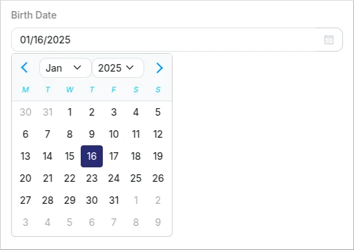
Date
This is a format specification of the String type.
The date picker will be used when format "date" is specified for a string property in the Schema.
Schema example
{
  "type": "object",
  "properties": {
    "birthDate": {
      "type": "string",
      "format": "date"
    }
  }
}
Options
| Key | Type | Default value | Description |
|---|---|---|---|
| title | text | - | Specifies a customized label for the field. |
| description | text | - | Shows a customized message for the field description. |
| readOnly | boolean | false | Sets the field to read-only. Editing is only possible via API (rest, wokers...) |
| readOnlyForUpdate | boolean | false | Sets the field as read-only when editing the form, i.e. at the time after the resource containing the form has been created. Editing via API (rest, wokers...) is possible at any time. If "readOnly" has already been defined, it is meaningless since both in creation and edition it will be "readOnly" |
This component supports UI Schema customizations, please refer to our UI Schema documentation section for that.
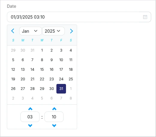
Date Time
This is a format specification of the String type.
The date-time picker will be used when format "date-time" is specified for a string property in the Schema.
Schema example
{
  "type": "object",
  "properties": {
    "date": {
      "type": "string",
      "format": "date-time"
    }
  }
}
Options
| Key | Type | Default value | Description |
|---|---|---|---|
| title | text | - | Specifies a customized label for the field. |
| description | text | - | Shows a customized message for the field description. |
| readOnly | boolean | false | Sets the field to read-only. Editing is only possible via API (rest, wokers...) |
| readOnlyForUpdate | boolean | false | Sets the field as read-only when editing the form, i.e. at the time after the resource containing the form has been created. Editing via API (rest, wokers...) is possible at any time. If "readOnly" has already been defined, it is meaningless since both in creation and edition it will be "readOnly" |
This component supports UI Schema customizations, please refer to our UI Schema documentation section for that.
File
This is a format specification of the String type.
This is one of our customizations, the upload file field will be used when the format: "kuflow-file" is specified for a string property in the Schema. It will allow you to upload files to the form.

Schema example
{
  "type": "object",
  "properties": {
    "file": {
      "type": "string",
      "format": "kuflow-file",
      "accept": "image/*,.pdf",
      "maxSize": "10MB"
    }
  }
}
Options
| Key | Type | Default value | Description |
|---|---|---|---|
| title | text | - | Specifies a customized label for the field. |
| description | text | - | Shows a customized message for the field description. |
| readOnly | boolean | false | Sets the field to read-only. Editing is only possible via API (rest, wokers...) |
| readOnlyForUpdate | boolean | false | Sets the field as read-only when editing the form, i.e. at the time after the resource containing the form has been created. Editing via API (rest, wokers...) is possible at any time. |
| accept | text | * | Specifies the acceptable file extensions to be uploaded |
| maxSize | text | integer | 20MB | Specifies a maximum file size acceptance. Can be a integer in bytes or a human text representation with this magnitudes: B, KB, MB, GB, TB For example: 1024 or "1MB". Important: On free plans the maximum file size is 20 MB, if you need to increase this limit please contact us at support. |
User
This is a format specification of the String type.
Other of our customizations, the user search field will be used when the format: "kuflow-principal" is specified for a string property in the Schema. It will allow you to search users in the organization.

Schema example
{
  "type": "object",
  "properties": {
    "user": {
      "type": "string",
      "format": "kuflow-principal"
    }
  }
}
Options
| Key | Type | Default value | Description |
|---|---|---|---|
| title | text | - | Specifies a customized label for the field. |
| description | text | - | Shows a customized message for the field description. |
| readOnly | boolean | false | Sets the field to read-only. Editing is only possible via API (rest, wokers...) |
| readOnlyForUpdate | boolean | false | Sets the field as read-only when editing the form, i.e. at the time after the resource containing the form has been created. Editing via API (rest, wokers...) is possible at any time. |
| groupId | text | - | Restrict user search to specified group id |
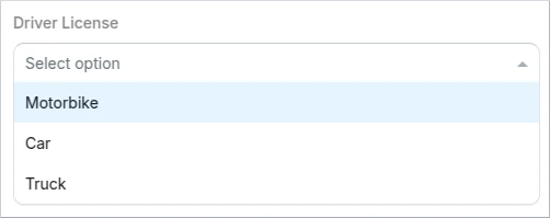
Enum single select
This is a format specification of the String type.
It is possible to configure a single selection, where only one option can be selected from a drop down list.
Schema example
{
  "properties": {
    "driverLicense": {
      "type": "string",
      "enum": [
        "MOTORBIKE",
        "CAR",
        "TRUCK"
      ]
    }
  }
}
Alternatively, you could use custom labels for each element in the list:
{
  "properties": {
    "driverLicense": {
      "type": "string",
      "oneOf": [
        {
          "const": "motorbike",
          "title": "MOTORBIKE"
        },
        {
          "const": "car",
          "title": "CAR"
        },
        {
          "const": "truck",
          "title": "TRUCK"
        }
      ]
    }
  }
}
Options
| Key | Type | Default value | Description |
|---|---|---|---|
| title | text | - | Specifies a customized label for the field. |
| description | text | - | Shows a customized message for the field description. |
| readOnly | boolean | false | Sets the field to read-only. Editing is only possible via API (rest, wokers...) |
| readOnlyForUpdate | boolean | false | Sets the field as read-only when editing the form, i.e. at the time after the resource containing the form has been created. Editing via API (rest, wokers...) is possible at any time. If "readOnly" has already been defined, it is meaningless since both in creation and edition it will be "readOnly" |
This component supports UI Schema customizations, please refer to our UI Schema documentation section for that.
Enum multiple choice
This is a format specification of the String type.
Different multiple-choice options are supported. By default, it will be represented as checkboxes, but it could be shown as a multi select array setting the keyword "uniqueItems" to false.

Schema example
{
  "type": "object",
  "properties": {
    "driverLicense": {
      "type": "array",
      "uniqueItems": true,
      "items":{
        "type":"string",
        "enum": [
          "MOTORBIKE",
          "CAR",
          "TRUCK"
        ]
      }
    }
  }
}
Alternatively, you could use custom labels for each element in the list:
{
  "type": "object",
  "properties": {
    "driverLicense": {
      "type": "array",
      "uniqueItems": true,
      "items":{
        "type":"string",
        "oneOf": [
        {
          "const": "motorbike",
          "title": "MOTORBIKE"
        },
        {
          "const": "car",
          "title": "CAR"
        },
        {
          "const": "truck",
          "title": "TRUCK"
        }
      ]
      }
    }
  }
}
Options
| Key | Type | Default value | Description |
|---|---|---|---|
| title | text | - | Specifies a customized label for the field. |
| description | text | - | Shows a customized message for the field description. |
| readOnly | boolean | false | Sets the field to read-only. Editing is only possible via API (rest, wokers...) |
| readOnlyForUpdate | boolean | false | Sets the field as read-only when editing the form, i.e. at the time after the resource containing the form has been created. Editing via API (rest, wokers...) is possible at any time. If "readOnly" has already been defined, it is meaningless since both in creation and edition it will be "readOnly" |
This component supports UI Schema customizations, please refer to our UI Schema documentation section for that.
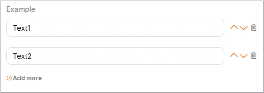
Array
Arrays are structures that allow multiple values to be stored in a single field, similar to a list or set of items in other programming languages.
Schema example
{
  "type": "object",
  "properties": {
    "example": {
      "type": "array",
      "items": {
        "type": "string"
      }
    }
  }
}
Options
| Key | Type | Default value | Description |
|---|---|---|---|
| title | text | - | Specifies a customized label for the field. |
| description | text | - | Shows a customized message for the field description. |
| readOnly | boolean | false | Sets the field to read-only. Editing is only possible via API (rest, wokers...) |
| readOnlyForUpdate | boolean | false | Sets the field as read-only when editing the form, i.e. at the time after the resource containing the form has been created. Editing via API (rest, wokers...) is possible at any time. If "readOnly" has already been defined, it is meaningless since both in creation and edition it will be "readOnly" |
| items | array | [] | Used to define the type or types of the elements within the array. It can be a single type or an array of types. |
| minItems | integer | - | Specifies the minimum length for the array. |
| maxItems | integer | - | Specifies the maximum length for the array. |
| uniqueItems | boolean | false | Setting the keyword to true ensures that each of the items in an array is unique. |
This component supports UI Schema customizations, please refer to our UI Schema documentation section for that.
Table
The "table" component allows you to create dynamic and interactive tables within your forms. It is particularly useful when you need to capture multiple entries or display tabular data.
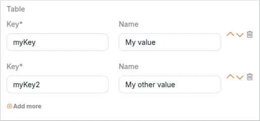
Schema example:
{
  "type": "object",
  "properties": {
    "table": {
      "type": "array",
      "items": {
        "type": "object",
        "required": [
          "key"
        ],
        "properties": {
          "key": {
            "type": "string"
          },
          "name": {
            "type": "string"
          }
        }
      }
    }
  }
}
Object
The "type: object" is used when you have related fields and need to capture more complex form data. It allows you to define a key-value structure, where each key represents a field in the form. This enables you to organize and structure the data efficiently. With the "object" type, you can capture and display data in a structured manner, making it easier to understand and work with complex form information.
Properties
This keyword is used to define the properties (or fields) that are expected to be present within an object. When the "type" keyword is set to "object", the "properties" keyword is used to specify the expected properties and their corresponding schemas.
{
  "type": "object",
  "properties": {
    "name": {
      "type": "string"
    },
    "age": {
      "type": "number"
    }
  }
}
In this example, the Schema defines an object with two properties: "name" and "age". The "name" property is expected to be a string, while the "age" property is expected to be a number.
Options
| Key | Type | Default value | Description |
|---|---|---|---|
| properties | object | Is an object, where each key is the name of a property and each value is a schema used to validate that property. | |
| required | array | [] | Specifies an array of property names that must be present in the object. |
| additionalProperties | boolean | false | Determines whether additional properties are allowed in the object. That is, properties that are not matched by properties or patternProperties |
| minProperties | integer | - | Sets the minimum number of properties allowed in the object. |
| maxProperties | integer | - | Sets the maximum number of properties allowed in the object. |
| patternProperties | object | It maps regular expressions to schemas. If a property name matches the given regular expression, the property value must validate against the corresponding schema. |
Definitions
To avoid repeating the same definitions for each item, it's recommended to use references ($ref) to a previously configured definition.
Example:
As you will see, an object definition called "PersonType" is created using the "definitions" keyword. This definition defines the common structure and properties for a person. Then, the "father" and "mother" properties within the main schema are set to reference the "PersonType" definition using the "$ref" keyword.
Without $ref:
{
  "type": "object",
  "properties": {
    "father": {
      "type": "object",
      "properties": {
        "name": {
          "type": "string"
        },
        "age": {
          "type": "integer",
          "minimum": 0,
          "maximum": 200
        }
      }
    },
    "mother": {
      "type": "object",
      "properties": {
        "name": {
          "type": "string"
        },
        "age": {
          "type": "integer",
          "minimum": 0,
          "maximum": 200
        }
      }
    }
  }
}
With $ref:
{
  "type": "object",
  "definitions": {
    "PersonType": {
      "type": "object",
      "properties": {
        "name": {
          "type": "string"
        },
        "age": {
          "type": "integer",
          "minimum": 0,
          "maximum": 200
        }
      }
    }
  },
  "properties": {
    "father": {
      "$ref": "#/definitions/PersonType"
    },
    "mother": {
      "$ref": "#/definitions/PersonType"
    }
  }
}
