UI Form schema
More information about the forms editor here
The UI Schema plays a crucial role in defining how the form fields are presented and organized within the user interface. It leverages JSON Forms' elements to configure the layout and visual styling of the form, ensuring an intuitive and user-friendly experience.
Here's a simple example to illustrate the concept:
{
  "type": "HorizontalLayout",
  "elements": [
    {
      "type": "Control",
      "scope": "#/properties/name"
    },
    {
      "type": "Control",
      "scope": "#/properties/email"
    },
    {
      "type": "Control",
      "scope": "#/properties/age"
    }
  ]
}
In this example, we use the "HorizontalLayout" element to stack the form fields horizontally. Each form field is represented by a "Control" element, and the "scope" property specifies the path to the corresponding field in the JSON Schema. This simple UI Schema configuration results in a user interface where the fields "firstName," "lastName," and "email" are displayed horizontally side by side.
By default, if no UI Schema is defined the form will behave as a Vertical Layout of all the elements defined in the schema root. Similarly, by specifying a UI Schema you can select which schema elements are displayed on the form and ignore others. It is also possible to nest different levels of layouts to design complex form structures.
By utilizing JSON Forms' elements and configuring the UI Schema effectively, you can create visually appealing and logically organized forms that enhance the overall user experience.
UI Components
In the UI Schema, you can utilize various elements to define the layout and appearance of your form. Here are some commonly used UI Schema elements with explanations and short examples to help you understand their purpose and usage
Control
The "Control" element is used to render a form field or control in the UI. It allows users to interact with the form by inputting data or making selections. For example, a text input field, a dropdown menu, or a checkbox can be rendered using the "Control" element.
UI Schema example
{
  "type": "control",
  "scope": "#/properties/name"
}
VerticalLayout
The "VerticalLayout" element is used to stack form fields vertically in the UI. It arranges the fields in a top-to-bottom manner, creating a vertical flow. This is useful when you want to display a series of related fields in a structured manner.
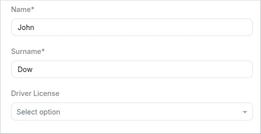
- Schema
- UI Schema
{
  "title": "A form",
  "description": "A simple form example",
  "type": "object",
  "properties": {
    "name": {
      "type": "string",
      "minLength": 3,
      "maxLength": 100
    },
    "surname": {
      "type": "string",
      "minLength": 3,
      "maxLength": 100
    },
    "driverLicense": {
      "type": "string",
      "enum": [
        "MOTORBIKE",
        "CAR",
        "TRUCK"
      ]
    }
  },
  "required": [
    "name",
    "surname"
  ]
}
{
  "type": "VerticalLayout",
  "elements": [
    {
      "type": "Control",
      "scope": "#/properties/name"
    },
    {
      "type": "Control",
      "scope": "#/properties/surname"
    },
    {
      "type": "Control",
      "scope": "#/properties/driverLicense"
    }
  ]
}
HorizontalLayout
The "HorizontalLayout" element is used to arrange form fields in a horizontal line. It aligns the fields side by side, allowing them to be displayed horizontally. This is suitable for situations where you want to present fields next to each other, such as in a multi-column form layout.
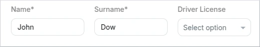
- Schema
- UI Schema
{
  "title": "A form",
  "description": "A simple form example",
  "type": "object",
  "properties": {
    "name": {
      "type": "string",
      "minLength": 3,
      "maxLength": 100
    },
    "surname": {
      "type": "string",
      "minLength": 3,
      "maxLength": 100
    },
    "driverLicense": {
      "type": "string",
      "enum": [
        "MOTORBIKE",
        "CAR",
        "TRUCK"
      ]
    }
  },
  "required": [
    "name",
    "surname"
  ]
}
{
  "type": "HorizontalLayout",
  "elements": [
    {
      "type": "Control",
      "scope": "#/properties/name"
    },
    {
      "type": "Control",
      "scope": "#/properties/surname"
    },
    {
      "type": "Control",
      "scope": "#/properties/driverLicense"
    }
  ]
}
Group
The "Group" element creates a container to group related fields together. It helps in organizing and visually separating fields that are part of a common category or section. Fields within a group can be displayed with a title or description, providing context to the user.
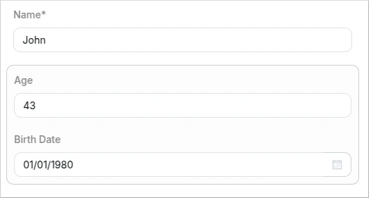
- Schema
- UI Schema
{
  "title": "A form",
  "description": "A simple form example",
  "type": "object",
  "properties": {
    "name": {
      "type": "string",
      "minLength": 3,
      "maxLength": 100
    },
    "age": {
      "type": "integer"
    },
    "birthDate": {
      "type": "string",
      "format": "date"
    },
    "bio": {
      "type": "string"
    },
    "driverLicense": {
      "type": "string",
      "enum": [
        "MOTORBIKE",
        "CAR",
        "TRUCK"
      ]
    }
  },
  "required": [
    "name",
    "surname"
  ]
}
{
  "type": "VerticalLayout",
  "elements": [
    {
      "type": "HorizontalLayout",
      "elements": [
        {
          "type": "Control",
          "scope": "#/properties/name"
        }
      ]
    },
    {
      "type": "Group",
      "elements": [
        {
          "type": "Control",
          "scope": "#/properties/age"
        },
        {
          "type": "Control",
          "scope": "#/properties/birthDate"
        }
      ]
    }
  ]
}
This UI Schema element provide flexibility in designing the layout and structure of your forms, allowing you to create user-friendly and intuitive interfaces for data entry.
Label
This type is used to create a non-editable text or label element that provides information or context within the form. Labels are typically used to display static text, instructions, or descriptions that help users understand the purpose or expected input of the form.
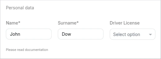
- Schema
- UI Schema
{
  "title": "A form",
  "description": "A simple form example",
  "type": "object",
  "properties": {
    "name": {
      "type": "string",
      "minLength": 3,
      "maxLength": 100
    },
    "surname": {
      "type": "string",
      "minLength": 3,
      "maxLength": 100
    },
    "driverLicense": {
      "type": "string",
      "enum": [
        "MOTORBIKE",
        "CAR",
        "TRUCK"
      ]
    }
  },
  "required": [
    "name",
    "surname"
  ]
}
{
  "type": "VerticalLayout",
  "elements": [
    {
      "type": "Label",
      "text": "Personal data"
    },
    {
      "type": "HorizontalLayout",
      "elements": [
        {
          "type": "Control",
          "scope": "#/properties/name"
        },
        {
          "type": "Control",
          "scope": "#/properties/surname"
        },
        {
          "type": "Control",
          "scope": "#/properties/driverLicense"
        }
      ]
    },
    {
      "type": "Label",
      "text": "Please read documentation",
      "options": {
        "size": "lb-1"
      }
    }
  ]
}
| Options | Description |
|---|---|
| size | Set the label size. The possible values are (from smallest to largest font size): lb-1, lb-2, lb-3, lb-4, lb-5 |
Rules
Rules enable the inclusion of interactive features in a form, such as the ability to hide or disable certain user interface elements based on specific conditions.
These rules can be applied to any element within the user interface schema and are defined using the "rule" property, which follows the format:
"rule": {
  "effect": "HIDE" | "SHOW" | "ENABLE" | "DISABLE",
  "condition": {
    "scope": "<UI Schema scope>",
    "schema": JSON Schema
  }
}
A rule basically works by first evaluating the condition property and in case it evaluates to true, executing the associated effect.
Rule Effect
The effect property determines what should happen to the attached UI schema element once the condition is met. Current effects include:
HIDE: hide the UI schema elementSHOW: show the UI schema elementDISABLE: disable the UI schema elementENABLE: enable the UI schema element
Rule Condition
The condition object of a rule comprises a scope and a schema property. The schema property adheres to the JSON schema standard, allowing for the utilization of any JSON schema specification within the rule condition. The schema undergoes validation against the data specified in the scope property. When the scope data matches the schema, the rule evaluates to true, triggering the application of the rule effect.
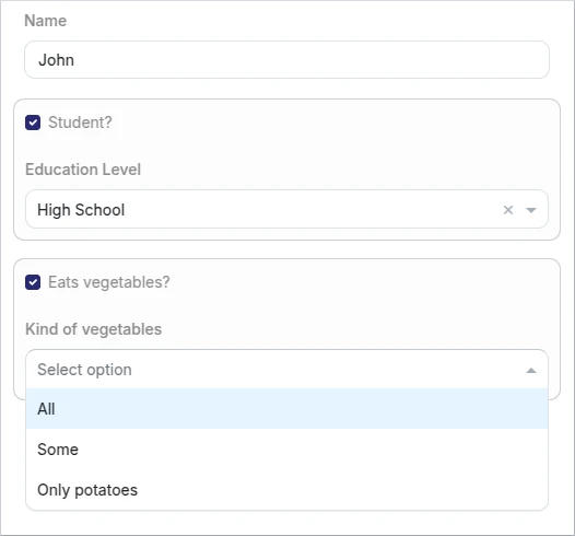
Below a rule example:
- Schema
- UI Schema
{
  "title": "Form",
  "description": "A form example",
  "type": "object",
  "properties": {
    "name": {
      "type": "string"
    },
    "education": {
      "type": "boolean"
    },
    "kindOfStudy": {
      "type": "string",
      "enum": ["Primary School", "High School", "University"]
    },
    "vegetables": {
      "type": "boolean"
    },
    "kindOfVegetables": {
      "type": "string",
      "enum": ["All", "Some", "Only potatoes"]
    }
  }
}
{
  "type": "VerticalLayout",
  "elements": [
    {
      "type": "Control",
      "label": "Name",
      "scope": "#/properties/name"
    },
    {
      "type": "Group",
      "elements": [
        {
          "type": "Control",
          "label": "Student?",
          "scope": "#/properties/education"
        },
        {
          "type": "Control",
          "label": "Education Level",
          "scope": "#/properties/kindOfStudy",
          "rule": {
            "effect": "ENABLE",
            "condition": {
              "scope": "#/properties/education",
              "schema": {
                "const": true
              }
            }
          }
        }
      ]
    },
    {
      "type": "Group",
      "elements": [
        {
          "type": "Control",
          "label": "Eats vegetables?",
          "scope": "#/properties/vegetables"
        },
        {
          "type": "Control",
          "label": "Kind of vegetables",
          "scope": "#/properties/kindOfVegetables",
          "rule": {
            "effect": "HIDE",
            "condition": {
              "scope": "#/properties/vegetables",
              "schema": {
                "const": false
              }
            }
          }
        }
      ]
    }
  ]
}
This example demonstrates the usage of two rules. The first rule controls the enabling of a control based on the status of the 'Student' checkbox.
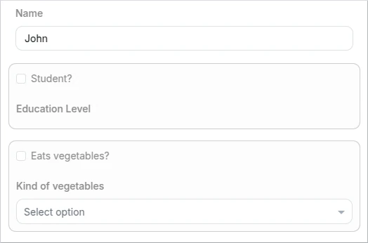
The second rule manages the visibility of a control depending on the selection of the "Eats vegetables?" checkbox.
UI Data Components options
Some of the elements defined in the schema have special UI-level properties that can be specified in the display schema. These options change the default display behaviors that are intrinsically defined for the data components. Of course, these are optional behaviors like the entire UI Schema, if they are not specified the component's default display will be shown.
Boolean
By default appears as a checkbox, but it can be changed to a toggle switch in the UI Schema options.

- Schema
- UI Schema
{
  "type": "object",
  "properties": {
    "student": {
      "type": "boolean"
    }
  }
}
{
  "type": "VerticalLayout",
  "elements": [
    {
      "type": "Control",
      "label": "Student",
      "scope": "#/properties/student"
    },
    {
      "type": "Control",
      "label": "Student",
      "scope": "#/properties/student",
      "options": {
        "toggle": true
      }
    }
  ]
}
Options
| Key | Type | Default value | Description |
|---|---|---|---|
| toggle | boolean | false | true: Change to a toggle switch in the user interface. false: Keep the checkbox format in the user interface. |
String
Sometimes it is necessary to have a rich formatting editor in a form field. For String components, it is possible to define the "multi" option in the display scheme to support a small formatting editor. Among other things, in this editor it is possible to set bold, italics or line breaks. The content generated by this field is represented in Markdown format so there is a standard and well-defined format to handle these inputs from the APIs and Workers.

- Schema
- UI Schema
{
  "type": "object",
  "properties": {
    "bio": {
      "type": "string"
    }
  }
}
{
  "type": "VerticalLayout",
  "elements": [
    {
      "type": "Control",
      "label": "Student",
      "scope": "#/properties/bio",
      "options": {
        "multi": true
      }
    }
  ]
}
Options
| Key | Type | Default value | Description |
|---|---|---|---|
| multi | boolean | false | true: Allow rich format (formatted as Markdown) false: Keep the default input text box in the user interface. |
Format actions
- Bold: add emphasis by making text bold
- Italic: add emphasis by making text italic
- Strikethrough: allows you to indicate that certain words are a mistake not meant for inclusion in the document.
- Heading one
- Heading two
- Heading three
- Unordered list
- Ordered list
- Code: to denote a word or phrase as code,
- Link: please insert a full URL (with protocol), like https://kuflow.com
- Hard break line: To insert more than one line break, you must press the
Ctrl+Enterkeys at the same time. In a markdown is a backslash (\) in a single line.
When you copy text written in such a component, the Markdown equivalent will be copied. This is useful in copy&paste actions or for debugging/writing text from APIs or Workers.
Example of rich text and the generated markdown:
- Generated markdown
- UI Schema
## Welcome to the official documentation.

\
\
This guide provides detailed information on the features, usage, and best practices for working with this system. Whether you are a new user or an experienced developer, this documentation will help you understand the core concepts and how to effectively utilize the available tools and functionalities.

This documentation is structured to provide step-by-step instructions, *API references*, and troubleshooting guides. You will find explanations of key components, configuration settings, and integration methods to ensure a seamless experience. Additionally, examples and code snippets are included to illustrate ~~practical implementations~~.

We recommend starting with the **Getting Started** section to familiarize yourself with the basics. From there, you can explore advanced topics, customization options, and troubleshooting tips. If you encounter any issues or have questions, refer to the [FAQ](https://kuflow.com) or reach out to the support team for assistance.

* Section one
* Section two

Python code:

`print("Hello, World!")`

Date
If you want to specify a date format other than the default format of the regional settings, you can specify both the date display format and the format in which it is saved in the form data json. But you have to keep in mind that in order to do this, the "format: "date" cannot be set in the general Schema for the field in question, as this would cause a conflict.
Make sure that the "format": "date" is not defined in the Schema in order to override the behavior in the UI Schema.

- Schema
- UI Schema
{
  "type": "object",
  "properties": {
    "date": {
      "type": "string"
    }
  }
}
{
  "type": "VerticalLayout",
  "elements": [
    {
      "type": "Control",
      "scope": "#/properties/date",
      "options": {
        "format": "date",
        "dateSaveFormat": "dd - MMM - yyyy",
        "dateFormat": "dd/MM/yyyy"
      }
    }
  ]
}
Options
| Key | Type | Default value | Description |
|---|---|---|---|
| dateFormat | text | regional default format | Defines how the data will be displayed (see ISO_8601 representation) |
| dateSaveFormat | text | regional default format | Defines how the data will be saved (see ISO_8601 representation) |
Examples
- "dd-MMM-yyyy": Represents the date as 25-May-1977
- "dd-MM-yyyy": Represents the date as 25-05-1977
Enum Single-Select
It is possible to change the visual component for enumerations or lists of values. By default, if nothing is specified in the UI Schema, the component is rendered as a value picker. However, if you prefer "radio" buttons, it is possible to specify them as well as their alignment direction.
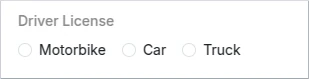
- Schema
- UI Schema
{
  "properties": {
    "driverLicense": {
      "type": "string",
      "enum": [
        "MOTORBIKE",
        "CAR",
        "TRUCK"
      ]
    }
  }
}
{
  "type": "VerticalLayout",
  "elements": [
    {
      "type": "Control",
      "scope": "#/properties/driverLicense",
      "options": {
        "format": "radio",
        "direction": "row"
      }
    }
  ]
}
Options
| Key | Type | Default value | Description |
|---|---|---|---|
| format | text | - | radio: Use radio buttons instead default selector |
| direction1 | text | column | row: Change the layout of the radio buttons to horizontal column: Change the layout of the radio buttons to vertical |
1 Only valid when "format" is "radio"
Enum Multiple-Choice
When "uniqueItems" is "false" or "undefined" in the Schema, we can set the direction of the checkboxes.
- Schema
- UI Schema
{
  "type": "object",
  "properties": {
    "driverLicense": {
      "type": "array",
      "uniqueItems": true,
      "items":{
        "type":"string",
        "enum": [
          "MOTORBIKE",
          "CAR",
          "TRUCK"
        ]
      }
    }
  }
}
{
  "type": "VerticalLayout",
  "elements": [
    {
      "type": "Control",
      "scope": "#/properties/driverLicense",
      "options": {
        "direction": "row"
      }
    }
  ]
}
Options
| Key | Type | Default value | Description |
|---|---|---|---|
| direction1 | text | column | row: Change the layout of the radio buttons to horizontal column: Change the layout of the radio buttons to vertical |
1 Only valid when "uniqueItems" is "true" in the Schema
Array
It is possible to hide sort buttons on Array type elements.
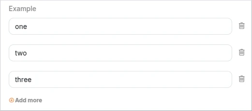
- Schema
- UI Schema
{
  "type": "object",
  "properties": {
    "example": {
      "type": "array",
      "items": {
        "type": "string"
      }
    }
  }
}
{
  "type": "VerticalLayout",
  "elements": [
    {
      "type": "Control",
      "scope": "#/properties/example",
      "options": {
        "showSortButtons": false
      }
    }
  ]
}
Options
| Key | Type | Default value | Description |
|---|---|---|---|
| showSortButtons | boolean | true | Show/hide order controls |
