Forms Creation
Not all features of JSON Forms are currently available; we have implemented certain customizations to adapt its functionality to our platform.
Introduction
KuFlow simplifies forms creation and management by utilizing a customized JSON Forms integration. With the help of Schema and UI Schema, you can define the form's data model, validation rules, and user interface layout. By leveraging the various elements provided by JSON Forms, you can create intuitive and dynamic forms, handle arrays, users, incorporate file uploads and custom messages seamlessly.
To start using KuFlow Forms, you need to define two main components: the Schema and the UI Schema.
KuFlow's Forms Editor
KuFlow provides a custom editor that simplifies the process of creating forms by offering a user-friendly interface. This editor is designed to allow developers or process analysts to effortlessly define the structure, validation rules, and layout of their forms.
One of the key features of KuFlow's custom editor is its ability to auto-fill form configurations. This functionality significantly reduces the time and effort required to create forms, as users can take advantage of pre-existing configurations and adapt them to their specific needs.
The provided examples will serve as a guide to demonstrate the possibilities of their use. Please note that the functionality's exact implementation and behavior will depend on any customization applied to suit your requirements.
Notation
By default, all form labels will be displayed in Capitalized format. However, for a more visually appealing display, you can use camelCase to separate words or the title option to customize it in each element.

Schema
The Schema represents the data model and validation rules for your form. It defines the structure, data types, and constraints of each field.
Here are some commonly used Schema properties:
- title: Here specifies the title or name of the form.
- description: Here provides a brief description of the form.
- type: Specifies the overall type of the form, typically "object" to represent a collection of fields.
- properties: Defines individual fields within the form, including their types and validation rules.
- required: Lists the fields that must be filled out before submitting the form.
Example:
{
  "title": "User Information",
  "description": "A form example",
  "type": "object",
  "properties": {
    "name": {
      "type": "string"
    },
    "email": {
      "type": "string",
      "format": "email"
    },
    "age": {
      "type": "number",
      "minimum": 18,
      "maximum": 99
    }
  },
  "required": ["name", "email"]
}
This code represents a JSON Schema for a user information form. It defines the structure and validation rules for the form fields. The form includes properties for "name", "email", and "age."
- The "name" property is of type "string" and does not have any additional constraints.
- The "email" property is also of type "string" and has a format constraint of "email", ensuring that the input matches an email address format.
- The "age" property is of type "number" and has minimum and maximum constraints of 18 and 99, respectively.
The "required" keyword specifies that the "name" and "email" fields are mandatory and must be filled out before submitting the form. The "title" and "description" provide additional information about the form.
Data Components
The Schema plays a crucial role in defining the data model and validation rules for your form. It outlines the structure of your form, specifies the data types for each field, and sets constraints to ensure data integrity.
By leveraging the Schema, you can effectively define the underlying structure and rules for your form's data.
Note that from here we'll start using the Ui Schema "Type: Control", please read the Control section before you start using KuFlow's Forms.
Integer
Renders a number input field, by default an integer number to use a float see
Number
Example:
{
  "properties": {
    "age": {
      "type": "integer",
      <<options>>
    }
  }
}
Options:
| Options | Description |
|---|---|
| title | Specifies a customized label for the field. |
| description | Shows a customized message for the field description. |
| default | Specifies a pre-set value for the field. |
| minimum | Specifies the minimum number allowed for the field. |
| maximum | Specifies the maximum number allowed for the field. |
{
  "type": "Control",
  "scope": "#/properties/age"
}
Boolean

Example:
{
  "properties": {
    "student": {
      "type": "boolean",
      <<options>>
    }
  }
}
Options:
| Options | Description |
|---|---|
| title | Specifies a customized label for the field. |
| description | Shows a customized message for the field description. |
| default | Specifies a pre-set value for the field. |
{
  "type": "Control",
  "scope": "#/properties/student",
  "options": {
    <<option>>
  }
}
Option:
| Option | Description |
|---|---|
| toggle | true Change to a toggle switch in the user interface. |
false Not mandatory, keep the checkbox format in the user interface. |
Number
Renders a number input field, by default a float number, to use an integer see
Type: Integer
Example:
{
  "properties": {
    "height": {
      "type": "number",
      <<options>>
    }
  }
}
Options:
| Option | Description |
|---|---|
| title | Specifies a customized label for the field. |
| description | Shows a customized message for the field description. |
| default | Specifies a pre-set value for the field. |
| minimum | Specifies the minimum value for the number |
| maximum | Specifies the maximum value for the number |
{
  "type": "Control",
  "scope": "#/properties/height"
}
String
Example:
{
  "properties": {
    "name": {
      "type": "string",
      <<options>>
    }
  }
}
Options:
| Options | Description |
|---|---|
| title | Specifies a customized label for the field. |
| description | Shows a customized message for the field description. |
| default | Specifies a pre-set value for the field. |
| minLength | Specifies the minimum length for the string |
| maxLength | Specifies the maximum length for the string |
| transform | "trimStart", "trimEnd", "trimLeft", "trimRight", "trim", "toLowerCase", "toUpperCase", "toEnumCase" |
| pattern | Allows the possibility of creating a RegEx validation for string content. |
| format | email: Represents a email format string |
tel: Represents a telephone format input field | |
password: Replaces the entered string with non-readable characters. | |
kuflow-file: Represents a file input field ( see File ) | |
kuflow-principal: Represents a user browsing field ( see User ) | |
date: Represents a date input field ( see Date ) |
{
  "type": "Control",
  "scope": "#/properties/name",
  "options": {
    <<option>>
  }
}
Option:
| Option | Description |
|---|---|
| multi | true: Represents a multiline text input field |
Date

Example:
{
  "properties": {
    "date": {
      "type": "string",
      "format": "date",
      <<options>>
    }
  }
}
Options:
| Option | Description |
|---|---|
| title | Specifies a customized label for the field. |
| description | Shows a customized message for the field description. |
| default | Specifies a pre-set value for the field. |
{
  "type": "Control",
  "scope": "#/properties/date",
  "options": {
    <<options>>
  }
}
Options:
| Option | Description |
|---|---|
| dateFormat | "dd-MM-yyyy": Represents the date in the UI as follows 25-05-1977 |
"dd-MMM-yyyy": Represents the date in the UI as follows 25-May-1977 | |
| dateSaveFormat | Defines how the data will be saved. |
File
Example:
{
  "properties": {
    "file": {
      "type": "string",
      "format": "kuflow-file",
      <<options>>
    }
  }
}
Options:
| Options | Description |
|---|---|
| title | Specifies a customized label for the field. |
| description | Shows a customized message for the field description. |
| accept | Specifies the acceptable file extensions to be uploaded |
| maxSize | Specifies a maximum file size acceptance |
{
  "type": "Control",
  "scope": "#/properties/file"
}
User
Other of our customizations, the user search field will be used when the format: "kuflow-principal" is specified for a string property in the Schema. It will allow you to search users in the organization.
Example:
{
  "properties": {
    "user": {
      "type": "string",
      "format": "kuflow-principal",
      <<options>>
    }
  }
}
Options:
| Options | Description |
|---|---|
| title | Specifies a customized label for the field. |
| description | Shows a customized message for the field description. |
| groupId | Restrict user search to specified group id, see |
For better understanding see the Users Searching Example
{
  "type": "Control",
  "scope": "#/properties/user"
}
Enum Single-Select

Example:
{
  "properties": {
    "driverLicense": {
      "type": "string",
      "enum": [
        "MOTORBIKE",
        "CAR",
        "TRUCK"
      ],
      <<options>>
    }
  }
}
Alternatively, you could use custom labels for each element in the list:
{
  "properties": {
    "driverLicense": {
      "type": "string",
      "oneOf": [
        {
          "const": "motorbike",
          "title": "MOTORBIKE"
        },
        {
          "const": "car",
          "title": "CAR"
        },
        {
          "const": "truck",
          "title": "TRUCK"
        }
      ],
      <<options>>
    }
  }
}
Options:
| Option | Description |
|---|---|
| title | Specifies a customized label for the field. |
| description | Shows a customized message for the field description. |
| default | Specifies a pre-set value for the field. |
{
  "type": "Control",
  "scope": "#/properties/driverLicense"
}

Example:
{
  "properties": {
    "driverLicense": {
      "type": "string",
      "enum": [
        "MOTORBIKE",
        "CAR",
        "TRUCK"
      ],
      <<options>>
    }
  }
}
Alternatively, you could use custom labels for each element in the list:
{
  "properties": {
    "driverLicense": {
      "type": "string",
      "oneOf": [
        {
          "const": "motorbike",
          "title": "MOTORBIKE"
        },
        {
          "const": "car",
          "title": "CAR"
        },
        {
          "const": "truck",
          "title": "TRUCK"
        }
      ],
      <<options>>
    }
  }
}
Options:
| Option | Description |
|---|---|
| title | Specifies a customized label for the field. |
| description | Shows a customized message for the field description. |
| default | Specifies a pre-set value for the field. |
{
  "type": "Control",
  "scope": "#/properties/driverLicense",
  "options": {
    "format": "radio",
    <<options>>
  }
}
Options:
| Option | Description |
|---|---|
| format | radio: Represents a group of radio buttons |
| direction | row: Change the layout of the buttons to horizontal |
Enum Multiple-Choice
KuFlow supports different multiple-choice options, where several options from the list can be selected. By default, it will be represented as checkboxes, but it could be shown as a multi select array setting the keyword "uniqueItems" to false.
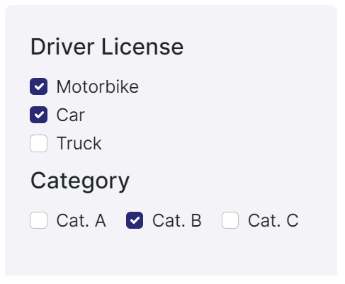
Example:
{
  "properties": {
    "driverLicense": {
      "type": "array",
      "uniqueItems": true,
      "items":{
        "type":"string",
        "enum": [
          "MOTORBIKE",
          "CAR",
          "TRUCK"
        ]
      },
      <<options>>
    }
  }
}
Alternatively, you could use custom labels for each element in the list:
{
  "properties": {
    "driverLicense": {
      "type": "array",
      "uniqueItems": true,
      "items":{
        "type":"string",
        "oneOf": [
        {
          "const": "motorbike",
          "title": "MOTORBIKE"
        },
        {
          "const": "car",
          "title": "CAR"
        },
        {
          "const": "truck",
          "title": "TRUCK"
        }
      ]
      },
      <<options>>
    }
  }
}
Options:
| Options | Description |
|---|---|
| title | Specifies a customized label for the field. |
| description | Shows a customized message for the field description. |
| default | Specifies a pre-set value for the field. |
| minItems | Specifies the minimum length for the array. |
| maxItems | Specifies the maximum length for the array. |
{
  "type": "Control",
  "scope": "#/properties/driverLicense",
  "options": {
    <<option>>
  }
}
Option:
| Option | Description |
|---|---|
| direction | row: Change the layout of the checkboxes to horizontal.2 |
2 Only works with checkbox format.
UI Schema
The UI Schema plays a crucial role in defining how the form fields are presented and organized within the user interface. It leverages JSON Forms' elements to configure the layout and visual styling of the form, ensuring an intuitive and user-friendly experience.
Here's a simple example to illustrate the concept:
{
  "type": "VerticalLayout",
  "elements": [
    {
      "type": "Control",
      "scope": "#/properties/name"
    },
    {
      "type": "Control",
      "scope": "#/properties/email"
    },
    {
      "type": "Control",
      "scope": "#/properties/age"
    }
  ]
}
In this example, we use the "VerticalLayout" element to stack the form fields vertically. Each form field is represented by a "Control" element, and the "scope" property specifies the path to the corresponding field in the JSON Schema. This simple UI Schema configuration results in a user interface where the fields "firstName," "lastName," and "email" are displayed vertically, one below the other.
By utilizing JSON Forms' elements and configuring the UI Schema effectively, you can create visually appealing and logically organized forms that enhance the overall user experience.
UI Components
In the UI Schema, you can utilize various elements to define the layout and appearance of your form. Here are some commonly used UI Schema elements with explanations and short examples to help you understand their purpose and usage
VerticalLayout
Example:
The type: VerticalLayout is exclusively utilized within the UI Schema.
{
  "type": "VerticalLayout",
  "elements": [
    {
      "type": "control",
      "scope": "#/properties/firstName"
    },
    {
      "type": "control",
      "scope": "#/properties/lastName"
    }
  ]
}
HorizontalLayout

Example:
The type: HorizontalLayout is exclusively utilized within the UI Schema.
{
  "type": "HorizontalLayout",
  "elements": [
    {
      "type": "control",
      "scope": "#/properties/email"
    },
    {
      "type": "control",
      "scope": "#/properties/phone"
    }
  ]
}
Group

Example:
The type: group is exclusively utilized within the UI Schema.
{
  "type": "group",
  "title": "Personal Information",
  "elements": [
    {
      "type": "control",
      "scope": "#/properties/firstName"
    },
    {
      "type": "control",
      "scope": "#/properties/lastName"
    }
  ]
}
This UI Schema element provide flexibility in designing the layout and structure of your forms, allowing you to create user-friendly and intuitive interfaces for data entry.
Label

Example:
The type: label is exclusively utilized within the UI Schema.
...
{
  "type": "Label",
  "text": "Personal data"
}
...
{
  "type": "Label",
  "text": "History information"
}
...
Advanced
In addition to the standard Schema elements, KuFlow also offers advanced components that provide more specialized configurations and functionalities for your forms. These components allow you to further enhance the user experience and handle specific requirements.
Control
The "Control" element is used to render a form field or control in the UI. It allows users to interact with the form by inputting data or making selections. For example, a text input field, a dropdown menu, or a checkbox can be rendered using the "Control" element.
Example:
The type: control is exclusively utilized within the UI Schema.
{
  "type": "control",
  "scope": "#/properties/name"
}
Array
Example:
{
  "properties": {
    "example": {
      "type": "array",
      "items": {
        "type": [type],
      },
      <<options>>
    }
  }
}
Options:
| Options | Description |
|---|---|
| title | Specifies a customized label for the field. |
| description | Shows a customized message for the field description. |
| items | Used to define the type or types of the elements within the array. It can be a single type or an array of types. |
| minItems | Specifies the minimum length for the array. |
| maxItems | Specifies the maximum length for the array. |
| uniqueItems | Setting the keyword to true ensures that each of the items in an array is unique. |
{
  "type": "Control",
  "scope": "#/properties/example",
  "options": {
    <<option>>
  }
}
Option:
| Option | Description |
|---|---|
| showSortButtons | true: Not mandatory, allows the possibility of ordering the items within the same array. |
false: If used, will hide the sort arrows. |
Files
Example:
{
  "properties": {
    "files": {
      "title": "Files",
      "type": "array",
      "items": {
        "type": "string",
        "format": "kuflow-file"
      }
    }
  }
}
To see the File schema options see File section.
To see the Array schema options see Array section.
{
  "type": "Control",
  "scope": "#/properties/files"
}
To see the Array UI schema options see Array section.
Users
Example:
{
  "properties": {
    "users": {
      "title": "Multiple users",
      "type": "array",
      "items": {
        "type": "string",
        "format": "kuflow-principal"
      }
    }
  }
}
To see the User schema options see User section.
To see the Array schema options see Array section.
{
  "type": "Control",
  "scope": "#/properties/users"
}
To see the Array UI schema options see Array section.
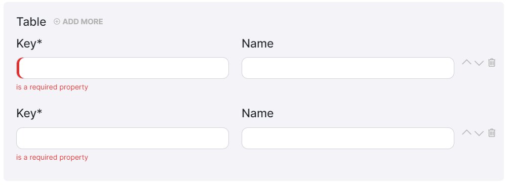
Table
Example:
{
  "properties": {
    "table": {
      "type": "array",
      <<options>>,
      "items": {
        "type": "object",
        "required": [
          "key"
        ],
        "properties": {
          "key": {
            "type": "string"
          },
          "name": {
            "type": "string"
          }
        }
      }
    }
  }
}
To see the Array Schema options see Array section.
{
  "type": "Control",
  "scope": "#/properties/table",
  "options": {
    <<option>>
  }
}
To see the Array UI schema options see Array section.
Object
The "type: object" is used when you have related fields and need to capture more complex form data. It allows you to define a key-value structure, where each key represents a field in the form. This enables you to organize and structure the data efficiently. With the "object" type, you can capture and display data in a structured manner, making it easier to understand and work with complex form information.
Properties
This keyword is used to define the properties (or fields) that are expected to be present within an object. When the "type" keyword is set to "object", the "properties" keyword is used to specify the expected properties and their corresponding schemas.
{
  "type": "object",
  "properties": {
    "name": {
      "type": "string"
    },
    "age": {
      "type": "number"
    }
  }
}
In this example, the Schema defines an object with two properties: "name" and "age". The "name" property is expected to be a string, while the "age" property is expected to be a number.
{
  "type": "object",
  <<options>>
}
Options:
| Options | Description |
|---|---|
| properties | Defines the expected properties and their schemas within the object. (as seen in properties example) |
| required | Specifies an array of property names that must be present in the object. |
| additionalProperties | Determines whether additional properties are allowed in the object. |
| minProperties | Sets the minimum number of properties allowed in the object. |
| maxProperties | Sets the maximum number of properties allowed in the object. |
| patternProperties | Defines a pattern that properties must match to be considered valid. |
| dependencies | Specifies dependencies between properties in the object. |
The type: object in JSON Schema is focused on defining the structure, properties, and constraints of an object data type. It does not directly include UI (User Interface) schema definitions.
Now, in case we wish to add some complexity and better organization to the data structure and its visualization, we can create an object within an object. Let's see how:
{
  "type": "object",
  "properties": {
    "father": {
      "type": "object",
      "properties": {
        "name": {
          "type": "string"
        },
        "age": {
          "type": "integer",
          "minimum": 0,
          "maximum": 200
        }
      }
    },
    "mother": {
      "type": "object",
      "properties": {
        "name": {
          "type": "string"
        },
        "age": {
          "type": "integer",
          "minimum": 0,
          "maximum": 200
        }
      }
    }
  }
}
{
  "type": "VerticalLayout",
  "elements": [
    {
      "type": "Label",
      "text": "Please introduce your Father data"
    },
    {
      "type": "HorizontalLayout",
      "elements": [
        {
          "type": "Control",
          "scope": "#/properties/father/properties/name"
        },
        {
          "type": "Control",
          "scope": "#/properties/father/properties/age"
        }
      ]
    },
    {
      "type": "Label",
      "text": "Please introduce your Mother data"
    },
    {
      "type": "HorizontalLayout",
      "elements": [
        {
          "type": "Control",
          "scope": "#/properties/mother/properties/name"
        },
        {
          "type": "Control",
          "scope": "#/properties/mother/properties/age"
        }
      ]
    }
  ]
}
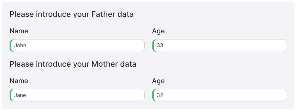
The Schema code defines an object type with two nested objects, "father" and "mother". Each nested object has properties for "name" (string type) and "age" (integer type with a minimum of 0 and a maximum of 200). This structure allows you to capture and store information in this way:
{
  "father": {
    "name": "John",
    "age": 33
  },
  "mother": {
    "name": "Jane",
    "age": 32
  }
}
Definitions
To avoid repeating the same definitions for each item, it's recommended to use references ($ref) to a previously configured definition.

Example:
As you will see, an object definition called "PersonType" is created using the "definitions" keyword. This definition defines the common structure and properties for a person. Then, the "father" and "mother" properties within the main schema are set to reference the "PersonType" definition using the "$ref" keyword.
{
  "type": "object",
  "properties": {
    "father": {
      "type": "object",
      "properties": {
        "name": {
          "type": "string"
        },
        "age": {
          "type": "integer",
          "minimum": 0,
          "maximum": 200
        }
      }
    },
    "mother": {
      "type": "object",
      "properties": {
        "name": {
          "type": "string"
        },
        "age": {
          "type": "integer",
          "minimum": 0,
          "maximum": 200
        }
      }
    }
  }
}
{
  "type": "object",
  "definitions": {
    "PersonType": {
      "type": "object",
      "properties": {
        "name": {
          "type": "string"
        },
        "age": {
          "type": "integer",
          "minimum": 0,
          "maximum": 200
        }
      }
    }
  },
  "properties": {
    "father": {
      "$ref": "#/definitions/PersonType"
    },
    "mother": {
      "$ref": "#/definitions/PersonType"
    }
  }
}
Rules
Rules enable the inclusion of interactive features in a form, such as the ability to hide or disable certain user interface elements based on specific conditions.
These rules can be applied to any element within the user interface schema and are defined using the "rule" property, which follows the format:
"rule": {
  "effect": "HIDE" | "SHOW" | "ENABLE" | "DISABLE",
  "condition": {
    "scope": "<UI Schema scope>",
    "schema": JSON Schema
  }
}
A rule basically works by first evaluating the condition property and in case it evaluates to true, executing the associated effect.
Rule Effect
The effect property determines what should happen to the attached UI schema element once the condition is met. Current effects include:
HIDE: hide the UI schema elementSHOW: show the UI schema elementDISABLE: disable the UI schema elementENABLE: enable the UI schema element
Rule Condition
The condition object of a rule comprises a scope and a schema property. The schema property adheres to the JSON schema standard, allowing for the utilization of any JSON schema specification within the rule condition. The schema undergoes validation against the data specified in the scope property. When the scope data matches the schema, the rule evaluates to true, triggering the application of the rule effect.
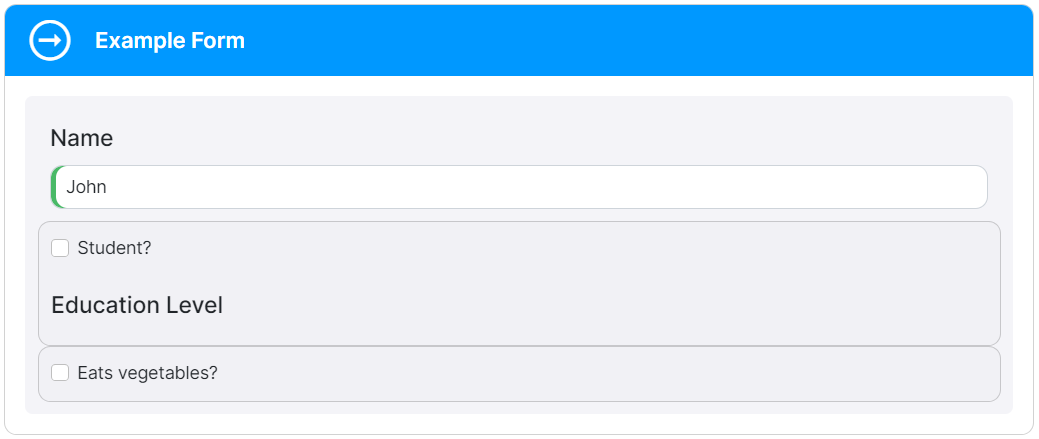
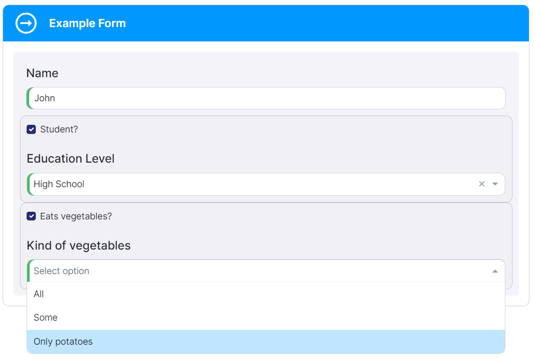
Below a rule example:
{
  "title": "Form",
  "description": "A form example",
  "type": "object",
  "properties": {
    "name": {
      "type": "string"
    },
    "education": {
      "type": "boolean"
    },
    "kindOfStudy": {
      "type": "string",
      "enum": ["Primary School", "High School", "University"]
    },
    "vegetables": {
      "type": "boolean"
    },
    "kindOfVegetables": {
      "type": "string",
      "enum": ["All", "Some", "Only potatoes"]
    }
  }
}
{
  "type": "VerticalLayout",
  "elements": [
    {
      "type": "Control",
      "label": "Name",
      "scope": "#/properties/name"
    },
    {
      "type": "Group",
      "elements": [
        {
          "type": "Control",
          "label": "Student?",
          "scope": "#/properties/education"
        },
        {
          "type": "Control",
          "label": "Education Level",
          "scope": "#/properties/kindOfStudy",
          "rule": {
            "effect": "ENABLE",
            "condition": {
              "scope": "#/properties/education",
              "schema": {
                "const": true
              }
            }
          }
        }
      ]
    },
    {
      "type": "Group",
      "elements": [
        {
          "type": "Control",
          "label": "Eats vegetables?",
          "scope": "#/properties/vegetables"
        },
        {
          "type": "Control",
          "label": "Kind of vegetables",
          "scope": "#/properties/kindOfVegetables",
          "rule": {
            "effect": "HIDE",
            "condition": {
              "scope": "#/properties/vegetables",
              "schema": {
                "const": false
              }
            }
          }
        }
      ]
    }
  ]
}
This example demonstrates the usage of two rules. The first rule controls the enabling of a control based on the status of the 'Student' checkbox. The second rule manages the visibility of a control depending on the selection of the "Eats vegetables?" checkbox.
Auto-fill Form Configurations
As mentioned earlier, KuFlow provides the convenience of auto-fill form configurations, streamlining the form creation process. Now, let's delve into the practical steps to get started with KuFlow and leverage its seamless integration with JSON Forms. Discover how KuFlow empowers you to rapidly build dynamic forms with ease.
Basic Form
A basic form could be used to capture essential user information such as name, email, and age.
Let's take a closer look at an example of a basic form implemented using JSON Forms and KuFlow.
Schema
The Schema defines the structure and validation rules for the form data. In this example, we have properties for "name", "surname", "age", "birthDate", "bio" and "driverLicense".
{
  "title": "A form",
  "description": "A simple form example",
  "type": "object",
  "properties": {
    "name": {
      "type": "string",
      "minLength": 3,
      "maxLength": 100
    },
    "surname": {
      "type": "string",
      "minLength": 3,
      "maxLength": 100
    },
    "age": {
      "type": "number",
      "maximum": 100
    },
    "birthDate": {
      "type": "string",
      "format": "date"
    },
    "bio": {
      "type": "string"
    },
    "driverLicense": {
      "type": "string",
      "enum": ["MOTORBIKE", "CAR", "TRUCK"]
    }
  },
  "required": ["name", "surname"]
}
The Schema defines the data types, validation constraints, and required fields. For example:
- The
nameandsurnameproperties must be strings with a minimum length of 3 and a maximum length of 100. - The
ageproperty is a number with a maximum value of 100. - The
birthDateproperty is expected to be in the "date" format. - The
bioproperty is a string - The
driverLicenseproperty is a string with a predefined set of options.
UI Schema
The UI Schema determines how the form controls are rendered in the user interface. In this example, we use a combination of vertical and horizontal layouts to arrange the controls.
{
  "type": "VerticalLayout",
  "elements": [
    {
      "type": "HorizontalLayout",
      "elements": [
        {
          "type": "Control",
          "scope": "#/properties/name"
        },
        {
          "type": "Control",
          "scope": "#/properties/surname"
        },
        {
          "type": "Control",
          "scope": "#/properties/driverLicense"
        }
      ]
    },
    {
      "type": "HorizontalLayout",
      "elements": [
        {
          "type": "Control",
          "scope": "#/properties/age"
        },
        {
          "type": "Control",
          "scope": "#/properties/birthDate"
        }
      ]
    },
    {
      "type": "Control",
      "scope": "#/properties/bio",
      "options": {
        "multi": true
      }
    }
  ]
}
The UI Schema defines the layout and behavior of the form controls in the user interface. It specifies that the name, surname, and driverLicense properties should be displayed in a horizontal layout, while the age and birthDate properties should be in another horizontal layout. The bio property is rendered as a control with multi-line input support.
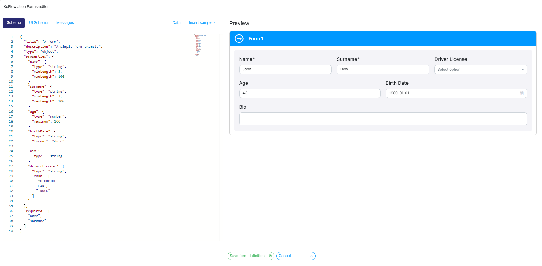
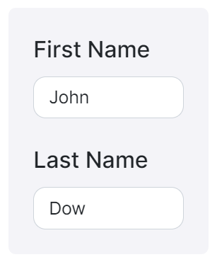
And below you will find the result of implementing the above Schema and UI Schema with the following data:
{
  "name": "John",
  "surname": "Dow",
  "age": 43,
  "birthDate": "1980-01-01"
}
The form will display the values "John" and "Dow" for the "name" and "surname" fields, respectively. The "age" field will show the value 43, and the "birthDate" field will display "1980-01-01". The "bio" field, being a multi-line input, is not specified in the data but is available for the user to fill in additional information.
Arrays
Arrays in JSON Forms enable users to add and manage multiple items dynamically. Let's explore an example of a form that captures a list of items.
Schema
The Schema defines the structure and validation rules for the array elements.
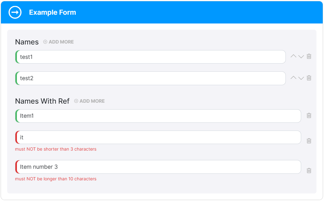
In this example, we have two properties: names and namesWithRef.
{
  "title": "Form",
  "description": "A form example",
  "type": "object",
  "definitions": {
    "Name": {
      "type": "string",
      "minLength": 3,
      "maxLength": 100
    }
  },
  "properties": {
    "names": {
      "type": "array",
      "items": {
        "type": "string",
        "minLength": 3,
        "maxLength": 100
      }
    },
    "namesWithRef": {
      "type": "array",
      "items": {
        "$ref": "#/definitions/Name"
      }
    }
  }
}
In the Schema, names represents an array of strings with specific length constraints, while namesWithRef demonstrates the use of a referenced definition. The $ref keyword allows us to reuse the "Name" definition, making it easier to manage and maintain the schema.
UI Schema
The UI Schema defines the layout and behavior of the array controls in the user interface. We'll use the Control element to render the array inputs.
{
  "type": "VerticalLayout",
  "elements": [
    {
      "type": "Control",
      "scope": "#/properties/names"
    },
    {
      "type": "Control",
      "scope": "#/properties/namesWithRef",
      "options": {
        "showSortButtons": false
      }
    }
  ]
}
In the UI Schema, we specify two Control elements associated with the names and namesWithRef properties. This arrangement ensures that the array controls are rendered properly in the user interface.
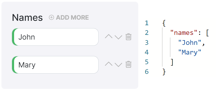
And below you will find the result of implementing the above Schema and UI Schema:
By utilizing this method, you can easily incorporate dynamic arrays into your forms, and then users can add and manage multiple items with ease.
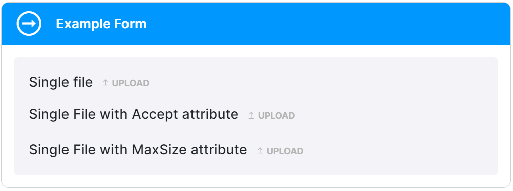
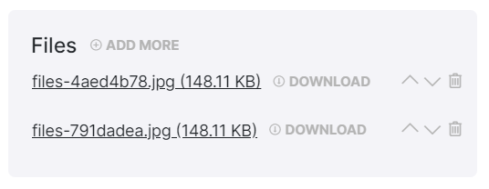
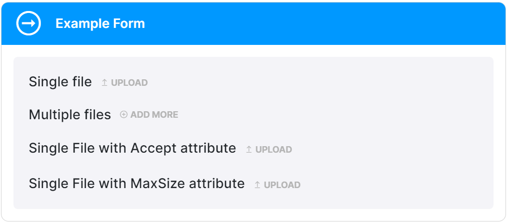
File Upload
File uploads are a common requirement in forms, and we provide a convenient way to handle them using the FileUploader control. With KuFlow you can seamlessly incorporate file upload functionality into your forms.
Let's take a closer look:
Schema
The Schema defines the structure of the form data related to file uploads. You can specify different properties to handle single files, multiple files, file extensions acceptance criteria, and file size limitations.
{
  "title": "Files",
  "type": "object",
  "properties": {
    "file": {
      "title": "Single file",
      "type": "string",
      "format": "kuflow-file"
    },
    "files": {
      "title": "Multiple files",
      "type": "array",
      "items": {
        "type": "string",
        "format": "kuflow-file"
      }
    },
    "fileAccept": {
      "title": "Single File with Accept attribute",
      "type": "string",
      "format": "kuflow-file",
      "accept": "image/*,.pdf"
    },
    "fileMaxSize": {
      "title": "Single File with MaxSize attribute",
      "type": "string",
      "format": "kuflow-file",
      "maxSize": 1000000
    }
  }
}
In the Schema, we define properties such as "file" for a single file upload (using "type": "string"), "files" for multiple files (using "type": "array" of strings).
UI Schema
The UI Schema determines how the file upload controls are presented in the user interface. By utilizing the Control element and associating it with the appropriate Schema properties, we can easily integrate file upload functionality.
{
  "type": "VerticalLayout",
  "elements": [
    {
      "type": "Control",
      "scope": "#/properties/file"
    },
    {
      "type": "Control",
      "scope": "#/properties/files"
    },
    {
      "type": "Control",
      "scope": "#/properties/fileAccept"
    },
    {
      "type": "Control",
      "scope": "#/properties/fileMaxSize"
    }
  ]
}
In the UI Schema, we define Control elements and associate them with the corresponding Schema properties. This arrangement ensures that the file upload controls are properly rendered in the user interface.
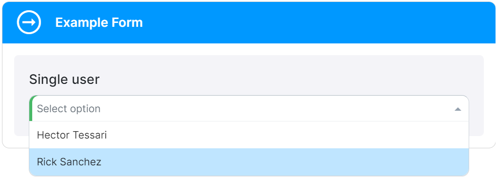
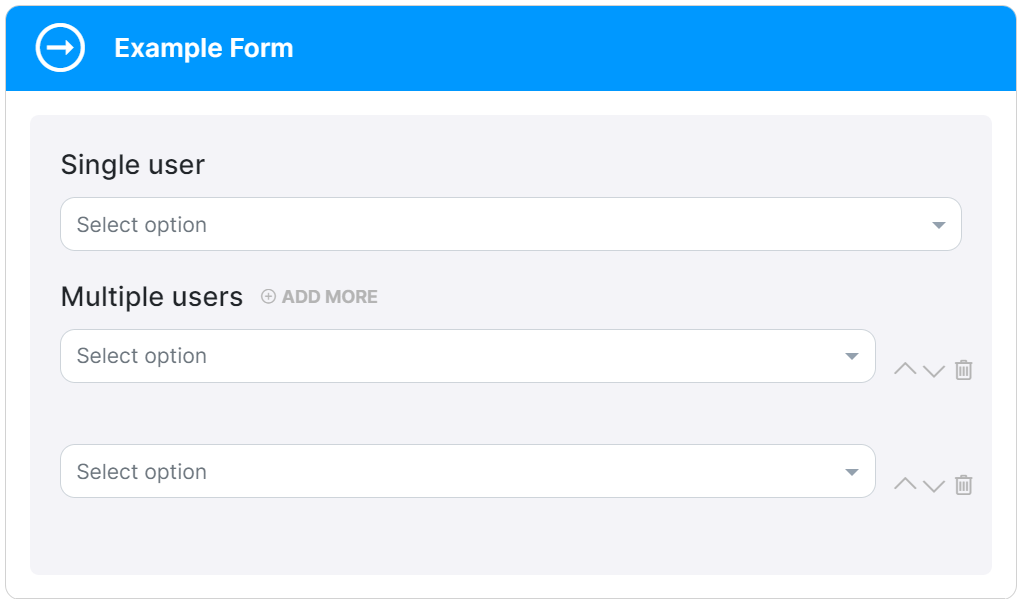
Users searching
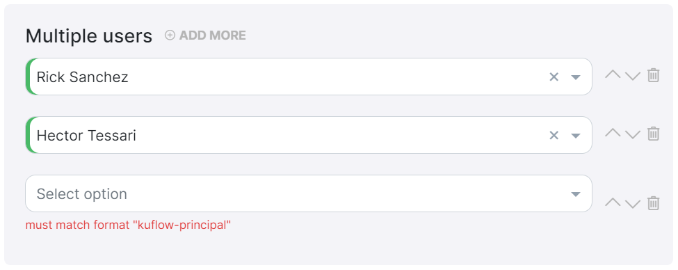
In some cases, you may need to create a form that allows users to search and select specific users within the organization. This can be useful when assigning tasks, granting permissions, or establishing user-related settings.
Let's explore an example:
Schema
The Schema defines the structure of the form data. In this case, we want to capture the selected user's information.
{
  "title": "Users",
  "type": "object",
  "properties": {
    "user": {
      "title": "Single user",
      "type": "string",
      "format": "kuflow-principal"
    },
    "users": {
      "title": "Multiple users",
      "type": "array",
      "items": {
        "type": "string",
        "format": "kuflow-principal"
      }
    }
  }
}
UI Schema
The UI Schema determines how the user selection form is presented to the user. We'll include a search field and a results list for users, allowing users to search and select from the available options.
{
  "type": "VerticalLayout",
  "elements": [
    {
      "type": "Control",
      "scope": "#/properties/user"
    },
    {
      "type": "Control",
      "scope": "#/properties/users"
    }
  ]
}
If you want to limit the list of users to a specific group, you can achieve this by utilizing the groupId option. Simply provide the group identifier value, which can be obtained from the group itself. This allows you to efficiently filter and display users belonging to a particular group
(You can see Groups for more information)
.

Example:
{
  "title": "Users",
  "type": "object",
  "properties": {
    "user": {
      "title": "Single user",
      "type": "string",
      "format": "kuflow-principal",
      "groupId": "b04657ec-158d-480d-b1f9-ce2cec70cb9a"
    }
  }
}
The groupId option is exclusively utilized within the Schema.
Custom Messages
You can customize the messages displayed in your forms to provide more informative instructions and error feedback to users. Here's an example of using custom messages in KuFlow.
Schema
The Schema defines the structure and validation rules for the form data. In this example, we have a property called name that is a string with a minimum length of 3 and a maximum length of 10.
{
  "title": "Custom messages",
  "type": "object",
  "properties": {
    "name": {
      "type": "string",
      "minLength": 3,
      "maxLength": 10
    }
  },
  "required": ["name"]
}
The name property must be a string with a minimum length of 3 characters and a maximum length of 10 characters.
UI Schema
The UI Schema determines how the form controls are rendered in the user interface. In this example, we use a vertical layout with a single control for the name property.
{
  "type": "VerticalLayout",
  "elements": [
    {
      "type": "Control",
      "scope": "#/properties/name",
      "options": {
        "showUnfocusedDescription": true
      }
    }
  ]
}
The name property is rendered as a control within a vertical layout. The "showUnfocusedDescription" option is set to true, indicating that the description should be displayed even when the control is not focused.
Messages
Custom messages allow you to define specific labels, descriptions, and error messages for each form control.
Here are the custom messages defined for the name property:
{
  "name.label": "User",
  "name.description": "This is a custom description",
  "name.error.minLength": "Must me greater than or equal than 3",
  "name.error.maxLength": "Must be less than or equal than 10",
  "name.error.required": "Required"
}

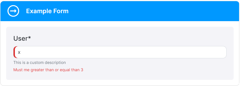
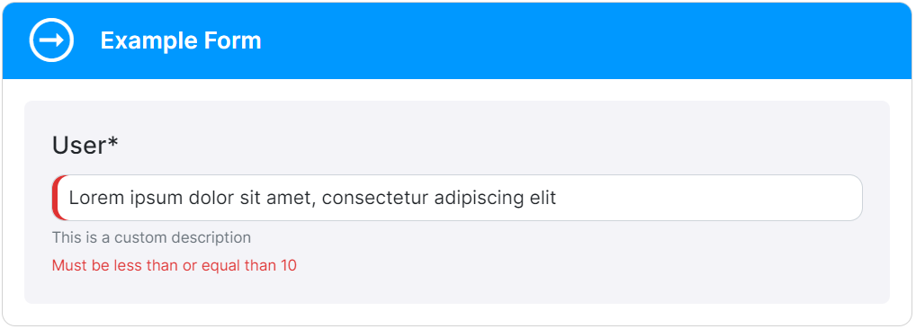
name.label:Sets the label for the "name" control as "User".name.description:Provides a custom description for the "name" control.name.error.minLength:Specifies the error message to display when the length of the "name" value is less than 3 characters.name.error.maxLength:Specifies the error message to display when the length of the "name" value exceeds 10 characters.name.error.required:Sets the error message to display when the "name" field is left empty.
By using custom messages, you can tailor the form's labels, descriptions, and error messages to match your specific requirements and provide clear guidance to users.
All these customizations enhance the user experience and ensure that users receive accurate feedback when filling out the form.
