Examples
With the following example, we will discover how to create dynamic forms successfully.
Don't forget to use the ctrl+space key combination in the editor to get code auto-completion suggestions, members, list and other features.
Basic Form
A basic form could be used to capture essential user information such as name, email, and age.
Let's take a closer look at an example of a basic form implemented using JSON Forms and KuFlow.
Schema
The Schema (which follows the Json Schema specification) defines the structure and validation rules for the form data. In this example, we have properties for "name", "surname", "age", "birthDate", "bio" and "driverLicense".
{
  "title": "A form",
  "description": "A simple form example",
  "type": "object",
  "properties": {
    "name": {
      "type": "string",
      "minLength": 3,
      "maxLength": 100
    },
    "surname": {
      "type": "string",
      "minLength": 3,
      "maxLength": 100
    },
    "age": {
      "type": "number",
      "maximum": 100
    },
    "birthDate": {
      "type": "string",
      "format": "date"
    },
    "bio": {
      "type": "string"
    },
    "driverLicense": {
      "type": "string",
      "enum": ["MOTORBIKE", "CAR", "TRUCK"]
    }
  },
  "required": ["name", "surname"]
}
The Schema defines the data types, validation constraints, and required fields. For example:
- The
nameandsurnameproperties must be strings with a minimum length of 3 and a maximum length of 100. - The
ageproperty is a number with a maximum value of 100. - The
birthDateproperty is expected to be in the "date" format. - The
bioproperty is a string - The
driverLicenseproperty is a string with a predefined set of options.
UI Schema
The UI Schema determines how the form controls are rendered in the user interface. In this example, we use a combination of vertical and horizontal layouts to arrange the controls.
{
  "type": "VerticalLayout",
  "elements": [
    {
      "type": "HorizontalLayout",
      "elements": [
        {
          "type": "Control",
          "scope": "#/properties/name"
        },
        {
          "type": "Control",
          "scope": "#/properties/surname"
        },
        {
          "type": "Control",
          "scope": "#/properties/driverLicense"
        }
      ]
    },
    {
      "type": "HorizontalLayout",
      "elements": [
        {
          "type": "Control",
          "scope": "#/properties/age"
        },
        {
          "type": "Control",
          "scope": "#/properties/birthDate"
        }
      ]
    },
    {
      "type": "Control",
      "scope": "#/properties/bio",
      "options": {
        "multi": true
      }
    }
  ]
}
The UI Schema defines the layout and behavior of the form controls in the user interface. It specifies that the name, surname, and driverLicense properties should be displayed in a horizontal layout, while the age and birthDate properties should be in another horizontal layout. The bio property is rendered as a control with multi-line input support.
And below you will find the result of implementing the above Schema and UI Schema with the following data:
{
  "name": "John",
  "surname": "Dow",
  "age": 43,
  "birthDate": "1980-01-01"
}
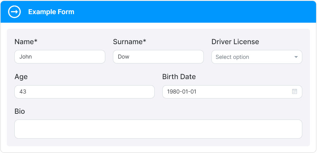
The form will display the values "John" and "Dow" for the "name" and "surname" fields, respectively. The "age" field will show the value 43, and the "birthDate" field will display "1980-01-01". The "bio" field, being a multi-line input, is not specified in the data but is available for the user to fill in additional information.
Arrays
Arrays in JSON Forms enable users to add and manage multiple items dynamically. Let's explore an example of a form that captures a list of items.
Schema
The Schema defines the structure and validation rules for the array elements.
In this example, we have two properties: names and namesWithRef.
{
  "title": "Form",
  "description": "A form example",
  "type": "object",
  "definitions": {
    "Name": {
      "type": "string",
      "minLength": 3,
      "maxLength": 100
    }
  },
  "properties": {
    "names": {
      "type": "array",
      "items": {
        "type": "string",
        "minLength": 3,
        "maxLength": 100
      }
    },
    "namesWithRef": {
      "type": "array",
      "items": {
        "$ref": "#/definitions/Name"
      }
    }
  }
}
In the Schema, names represents an array of strings with specific length constraints, while namesWithRef demonstrates the use of a referenced definition. The $ref keyword allows us to reuse the "Name" definition, making it easier to manage and maintain the schema.
UI Schema
The UI Schema defines the layout and behavior of the array controls in the user interface. We'll use the Control element to render the array inputs.
{
  "type": "VerticalLayout",
  "elements": [
    {
      "type": "Control",
      "scope": "#/properties/names"
    },
    {
      "type": "Control",
      "scope": "#/properties/namesWithRef",
      "options": {
        "showSortButtons": false
      }
    }
  ]
}
In the UI Schema, we specify two Control elements associated with the names and namesWithRef properties. This arrangement ensures that the array controls are rendered properly in the user interface.
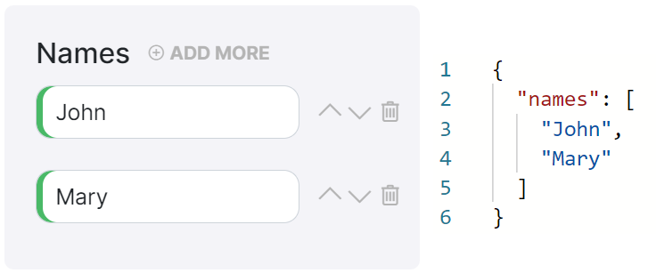
And below you will find the result of implementing the above Schema and UI Schema:
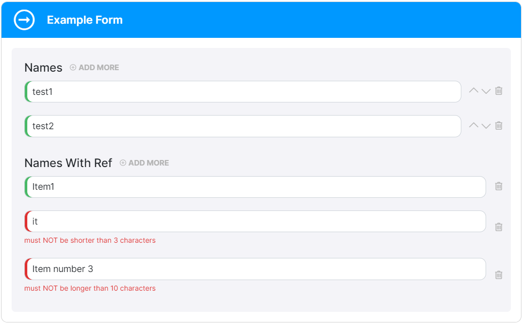
By utilizing this method, you can easily incorporate dynamic arrays into your forms, and then users can add and manage multiple items with ease.
File Upload
File uploads are a common requirement in forms, and we provide a convenient way to handle them using the FileUploader control. With KuFlow you can seamlessly incorporate file upload functionality into your forms.
Let's take a closer look:
Schema
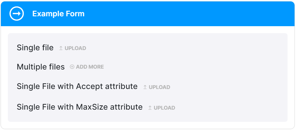
The Schema defines the structure of the form data related to file uploads. You can specify different properties to handle single files, multiple files, file extensions acceptance criteria, and file size limitations.
{
  "title": "Files",
  "type": "object",
  "properties": {
    "file": {
      "title": "Single file",
      "type": "string",
      "format": "kuflow-file"
    },
    "files": {
      "title": "Multiple files",
      "type": "array",
      "items": {
        "type": "string",
        "format": "kuflow-file"
      }
    },
    "fileAccept": {
      "title": "Single File with Accept attribute",
      "type": "string",
      "format": "kuflow-file",
      "accept": "image/*,.pdf"
    },
    "fileMaxSize": {
      "title": "Single File with MaxSize attribute",
      "type": "string",
      "format": "kuflow-file",
      "maxSize": 1000000
    }
  }
}
In the Schema, we define properties such as "file" for a single file upload (using "type": "string"), "files" for multiple files (using "type": "array" of strings).
UI Schema
The UI Schema determines how the file upload controls are presented in the user interface. By utilizing the Control element and associating it with the appropriate Schema properties, we can easily integrate file upload functionality.
{
  "type": "VerticalLayout",
  "elements": [
    {
      "type": "Control",
      "scope": "#/properties/file"
    },
    {
      "type": "Control",
      "scope": "#/properties/files"
    },
    {
      "type": "Control",
      "scope": "#/properties/fileAccept"
    },
    {
      "type": "Control",
      "scope": "#/properties/fileMaxSize"
    }
  ]
}
In the UI Schema, we define Control elements and associate them with the corresponding Schema properties. This arrangement ensures that the file upload controls are properly rendered in the user interface.
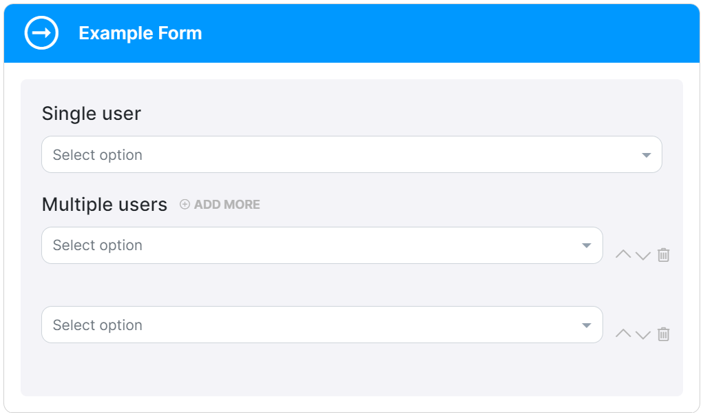
Users searching
In some cases, you may need to create a form that allows users to search and select specific users within the organization. This can be useful when assigning tasks, granting permissions, or establishing user-related settings.
Let's explore an example:
Schema
The Schema defines the structure of the form data. In this case, we want to capture the selected user's information.
{
  "title": "Users",
  "type": "object",
  "properties": {
    "user": {
      "title": "Single user",
      "type": "string",
      "format": "kuflow-principal"
    },
    "users": {
      "title": "Multiple users",
      "type": "array",
      "items": {
        "type": "string",
        "format": "kuflow-principal"
      }
    }
  }
}
UI Schema
The UI Schema determines how the user selection form is presented to the user. We'll include a search field and a results list for users, allowing users to search and select from the available options.
{
  "type": "VerticalLayout",
  "elements": [
    {
      "type": "Control",
      "scope": "#/properties/user"
    },
    {
      "type": "Control",
      "scope": "#/properties/users"
    }
  ]
}
If you want to limit the list of users to a specific group, you can achieve this by utilizing the groupId option. Simply provide the group identifier value, which can be obtained from the group itself. This allows you to efficiently filter and display users belonging to a particular group
(You can see Groups for more information)
.

Example:
{
  "title": "Users",
  "type": "object",
  "properties": {
    "user": {
      "title": "Single user",
      "type": "string",
      "format": "kuflow-principal",
      "groupId": "b04657ec-158d-480d-b1f9-ce2cec70cb9a"
    }
  }
}
The groupId option is exclusively utilized within the Schema.
Custom Messages
You can customize the messages displayed in your forms to provide more informative instructions and error feedback to users. Here's an example of using custom messages in KuFlow.
Schema
The Schema defines the structure and validation rules for the form data. In this example, we have a property called name that is a string with a minimum length of 3 and a maximum length of 10.
{
  "title": "Custom messages",
  "type": "object",
  "properties": {
    "name": {
      "type": "string",
      "minLength": 3,
      "maxLength": 10
    }
  },
  "required": ["name"]
}
The name property must be a string with a minimum length of 3 characters and a maximum length of 10 characters.
UI Schema
The UI Schema determines how the form controls are rendered in the user interface. In this example, we use a vertical layout with a single control for the name property.
{
  "type": "VerticalLayout",
  "elements": [
    {
      "type": "Control",
      "scope": "#/properties/name",
      "options": {
        "showUnfocusedDescription": true
      }
    }
  ]
}
The name property is rendered as a control within a vertical layout. The "showUnfocusedDescription" option is set to true, indicating that the description should be displayed even when the control is not focused.
Messages
Custom messages allow you to define specific labels, descriptions, and error messages for each form control.
Here are the custom messages defined for the name property:
{
  "name.label": "User",
  "name.description": "This is a custom description",
  "name.error.minLength": "Must me greater than or equal than 3",
  "name.error.maxLength": "Must be less than or equal than 10",
  "name.error.required": "Required"
}

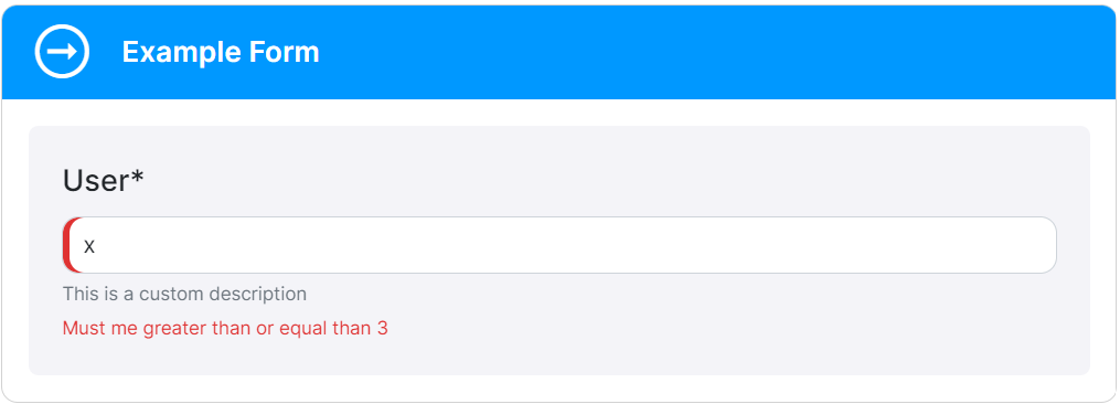
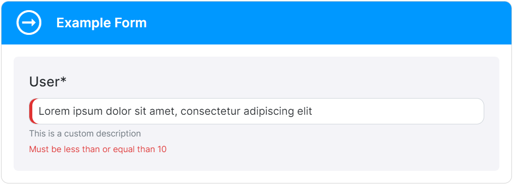
name.label:Sets the label for the "name" control as "User".name.description:Provides a custom description for the "name" control.name.error.minLength:Specifies the error message to display when the length of the "name" value is less than 3 characters.name.error.maxLength:Specifies the error message to display when the length of the "name" value exceeds 10 characters.name.error.required:Sets the error message to display when the "name" field is left empty.
By using custom messages, you can tailor the form's labels, descriptions, and error messages to match your specific requirements and provide clear guidance to users.
All these customizations enhance the user experience and ensure that users receive accurate feedback when filling out the form.
